Page MenuHome GnuPG

Visual representation of signature is a bit ugly
Open, NormalPublic

Description

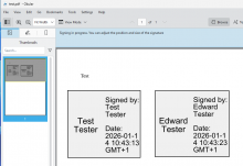
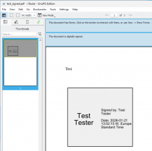
The visual representation of a signed document is a bit ugly.

The biggest issue is how it should look, which options we might want to make user configurable and such.

See also https://bugs.kde.org/show_bug.cgi?id=443403 and https://bugs.kde.org/show_bug.cgi?id=474222, https://bugs.kde.org/show_bug.cgi?id=473433 for more examples and more reports.

Event Timeline

Unfortunately, "make it not ugly" is a bit hard to work with. I'm open for ideas.

werner triaged this task as Normal priority.Sep 26 2023, 3:21 PM
svuorela changed the task status from Open to Testing.Aug 8 2025, 12:04 PM
ebo moved this task from Backlog to QA on the gpd5x board.

Was anything changed? What to test here?

Current state in gpg4win-5.0.0-beta479 @ win11:

Try compare with a gpg4win 3.latest.

The first time Okular was included is gpg4win-4.2.0:

Compared to this, it has not changed much (slightly bigger font for the details, GMT notation instead of timezone).
Should this be improved further or is this resolved?

timegrid changed the task status from Testing to Open.Tue, Mar 3, 2:17 PM
timegrid moved this task from QA to WIP on the gpd5x board.
timegrid added a project: needs discussion.