Page MenuHome GnuPG

Kleopatra: Get rid of the imported certificates tabs
Closed, ResolvedPublic

Description

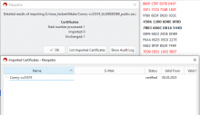
The import tabs are not always useful and tend to accumulate if you import a lot of single certificate e.g. via "Search on server". Especially since version VSD 3.3.0.
This can be annoying and we got a customer feedback on this.

Edit 2025-05-22:

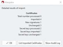
We decided to remove the import tabs. Instead a button will be provided in the import result window to optionally open a separate import window. This will show the same as an import tab currently does.

Details

External Link
RT34843
Version
VSD 3.3.0

Event Timeline

ebo triaged this task as Normal priority.Apr 30 2025, 4:24 PM
ebo created this task.
ebo renamed this task from Draft: Kleopatra: Make tabs for imported certificates configurable or obsolete to Kleopatra: Get rid of the imported certificates tabs.May 22 2025, 3:21 PM
ebo updated the task description. (Show Details)

Possibilities for the button text:
"Show import window"
"Show import tab" (I know it is no tab but its shorter)

And a tooltip "Show imported certificates" would be great.

TobiasFella changed the task status from Open to Testing.Jul 10 2025, 1:35 PM
TobiasFella moved this task from Backlog to WIP on the gpd5x board.

tested with Gpg4win-5.0.0-beta345:

Ok, no import tab any more. The window which opens after hitting the import button plus below the one which opens on clicking the button "List Imported Certificates":

I would like a text in the title of the first window, too: "Import Results"
And I am a bit irritated by the "Imported Certificates" in the title of the second window, as window one in my case says "Imported: 0".

How about we retitle the second window to "Processed Certificates"? This would be true in all cases. Even for complex imports like:


We would need to change the button text, too. That would then be "List Processed Certificates", but I wonder if we could shorten that to "List Processed"? I've no good idea how to translate this to German, though. Any better ideas?
It would be easy if we could move that button behind the "Total number processed" line, then we could get away with "Show"…

And I wonder about the blue line below the first content row in the second window. It seems to be below that line regardless if there are more lines following or not. It is always only one blue line. Can we get rid of it?

TobiasFella mentioned this in Unknown Object (Maniphest Task).Jul 21 2025, 9:56 AM

Another suggestion for the changed button text was simply "List Certificates" as the context implies which those will be. I like it.

ebo claimed this task.
ebo moved this task from QA to Done on the gpd5x board.

closing, rest in follow up ticket.