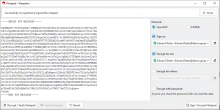
For reference, this is the current layout:
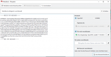
To improve the usability:
Move the buttons currently on top and the success (or error) message field to below the text field. These buttons stay left aligned.
Edit 2025-09-09: moving the success message is impractical, as there could be several signatures. Therefore on top is better.