Page MenuHome GnuPG

Kleopatra: Several problems with icons in high contrast modes
Open, NormalPublic

Description

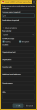
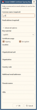
With the dark high contrast modes there are some problems with the icon coloring. I tested this on Windows 10 with high contrast mode No. 1.

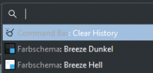
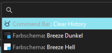
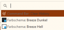
Wrong coloring of toolbar icons and text:


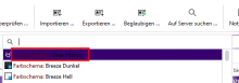
-> This is a bug in the Breeze style. With fusion style and windowsvista style icons and text have correct colors.

Wrong coloring of Close button icon:

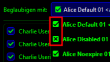
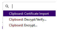
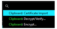
Wrong/inconsistent coloring of disabled menu entry icons:

Wrong coloring of Close menu entry icon:

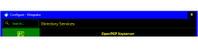
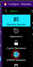
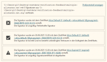
Wrong coloring of config module title:


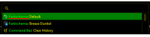
-> This is a bug in the Breeze style. With fusion style and windowsvista style the title is yellow on black (as other text).

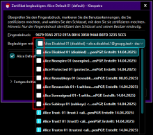
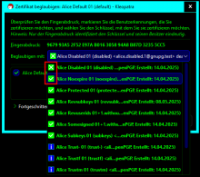
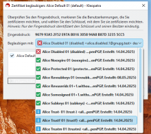
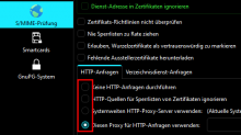
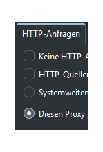
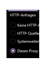
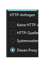
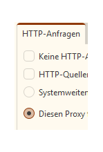
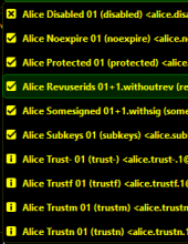
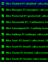
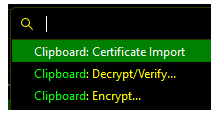
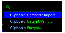
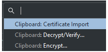
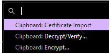
Wrong/bad coloring of icons:


-> With the dark high-contrast color schemes the success/error icon has very bad contrast (white on yellow). This is a general problem of the Breeze icons in combination with automatic icon coloring.

Event Timeline

ikloecker created this task.
ikloecker added a project: a11y.

The wrong/inconsistent coloring of the icons has been fixed.

With the above patch for breeze the toolbar and the configuration dialog title now also look correct in high-contrast mode.

ikloecker changed the task status from Open to Testing.Apr 3 2025, 11:59 AM
ikloecker changed the task status from Testing to Open.May 8 2025, 5:08 PM

I found more issues with the success, warning, and error icons we show in various places.

on gpg4win-5.0.0-beta190@win10 (high contrast):

  • contrast black

  • contrast nr. 2

  • normal

ikloecker changed the task status from Open to Testing.Tue, Jun 24, 12:07 PM
ikloecker moved this task from WIP to QA on the gpd5x board.

Most issues with icons in high contrast modes (of Windows 10) should have been fixed. Needs to be verified especially with the high contrast modes of Windows 11.

Tested: gpg4win-5.0.0-beta330 @ win10

Issues found
  • find action (menu: help)
white
black
nr1 (at least not optimal)
  • calendar (e.g. selection of cert expiration date)
white
black
nr2
  • new smime cert generation dialog
white
black
nr1
nr2
Unsure
  • invalid state in cert list tooltip (red on black)
black, nr1, nr2
  • smime icon in kleopatra config (was already marked in the description screenshot)
black, nr1, nr2
  • green invalid state icon, e.g. on certificate selection (probably as intended?)
nr2
  • unselected radio/checkboxes are a bit hard to see and worse to distinguish, a bit more contrast would be better in my opinion
black, nr1, nr2
  • the link color on black background feels also a bit hard to read, but it's the same in native windows settings dialogs, so probably to be expected
black, nr1, nr2

Regarding the "unsure" findings:

  • invalid state in cert list tooltip (red on black)

    That's not okay, i.e. it should be changed/fixed.
  • smime icon in kleopatra config (was already marked in the description screenshot)

    That's mostly okay. In general, colored icons are acceptable in high contrast. Older Windows apps, e.g. Windows Explorer, have only colored icons and that's apparently fine. I'd still change the S/MIME Validation icon because it looks out-of-place as only colored icon and because I have no idea what the globe has to do with S/MIME Validation. There has to be a better symbolic icon for this.
  • green invalid state icon, e.g. on certificate selection (probably as intended?)

    That's okay, i.e. it's as intended. The icons are colored as normal text. Green is just a very bad choice as normal text color. The alternative would be using icons with hard-coded colors. I need to discuss this with the KDE Visual Design Group.
  • unselected radio/checkboxes are a bit hard to see and worse to distinguish, a bit more contrast would be better in my opinion

    That's not okay, i.e. this needs to be improved. This is one of the reasons why I think that the KDE Breeze style is just not suitable for high-contrast. On the other hand, KDE is looking into such accessibility problems at the moment.
  • the link color on black background feels also a bit hard to read, but it's the same in native windows settings dialogs, so probably to be expected

    That's okay, i.e. it's as intended. This should be the color that the Windows high contrast color scheme defines as color for links.
ikloecker changed the task status from Testing to Open.Thu, Jun 26, 9:35 AM
ikloecker moved this task from QA to WIP on the gpd5x board.

Tested: gpg4win-5.0.0-beta330 @ win11

Thanks for the feedback. The issues are the same as on win10:

  • find action
abendämmerung
nachthimmel
wasser
wüste
  • calendar (18th is mouse hover, 25th is selected)
abendämmerung
nachthimmel
wasser
wüste
  • new smime cert generation dialog (same)
  • invalid state in cert list tooltip (same)
  • smime icon in kleopatra config (same)

In general win11 contrast modes look better and don't have those issues:

  • green/yellow invalid state icon (all icons are black/white now; note the issue with missing borders in nachthimmel signature validation)
abendämmerung
nachthimmel
wasser
wüste
  • unselected radio/checkboxes contrast is better (exception: nachthimmel)
abendämmerung
nachthimmel
wasser
wüste

Addionally

  • the "folder up" icon of the open file dialog looks disabled in all dark modes (on wüste it's ok)

Thanks for the Windows 11 screen shots.

Re: issue with missing borders in nachthimmel signature validation
-> This is also present in all dark Windows 10 contrast modes. The border has the same color as the background (pitch black aka #000000). The technical reason is that anything times zero yields zero. That's easy to fix by special-casing the case #000000.

Re: the "folder up" icon of the open file dialog looks disabled in all dark modes
-> This is the standard Windows file dialog (which is basically the Windows Explorer without the menu bar). There's nothing we can do.