Page MenuHome GnuPG

Kleopatra: Separate smartcard window with simplified layout
Open, NormalPublic

Description

  • The Smartcard screen should open in a new, non modal window.
  • The layout for different card type are harmonized.
  • The button clutter is removed in favor of popup and context menus.
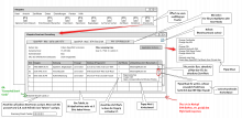
more details:

  • Slots of an application are arranged as a table, because there are Smartcard applications with several slots.
  • If the slots themself have no information about their capabilities, the gpg default is used.
  • For each slots keygrip the number of matching keygrips is shown, as well as the primary UID of the most recent certificate.
  • A "refresh" button to re-scan for smartcards.
  • The lower left corner of the screen shows a spinner while scanning for smartcards. this changes to the number of found smartcards.
  • Each slot has an popup menu button with possible actions, and an equivalent context menu.
  • The header are shows information from the smartcard, if available for the application type.
  • In the upper right corner is a popup menu button with general actions for the cards application.

Revisions and Commits

rLIBKLEO Libkleo
rKLEOPATRA Kleopatra

Event Timeline

ikloecker moved this task from Restricted Project Column to Restricted Project Column on the Restricted Project board.Jun 20 2024, 8:39 PM
ikloecker renamed this task from Kleopatra: seperate smartcard window with simplyfied layout to Kleopatra: Separate smartcard window with simplified layout.Jun 21 2024, 2:38 PM

First mock of new UI for PIV

For comparison the old UI for PIV

Remarks:

  • I don't think the key grip column is useful. The key grip is way too long and we hide this information in all other lists by default. The IDs which link different things are the fingerprints. The only useful information the key grip gives here is whether there is a key stored in the slot or not.
  • Usage will be made more verbose. For PIV it overlaps with the names of the slots. We could show a number in the Slot column (although the numbers are pretty arbitrary and don't have any meaning; the key refs would be better, but they are not user friendly) and show the PIV names in the Usage column. On the other hand, "Key Management" doesn't really tell that it's an encryption key.
  • The Created column is empty because PIV keys do not have a creation date (or scdaemon doesn't list it).
  • I omitted the "Number of certificates" column. I propose to show multiple rows if there are multiple certificates for a card key. Otherwise, the user will have no way to get any information about the other certificates with the key grip.
  • The old UI shows the algorithm, but this information is probably not important. I'd still add a column that is hidden by default.

For first feedback on the new slot/certificate table.

New UI for PKCS#15 card


For comparison the old UI

Pro:

  • OpenPGP certificates and S/MIME certificates in one table
  • Fingerprint instead of Key ID
  • Show Details button also for S/MIME (previously, only double click opened Details)

Con:

  • No validity information (Valid From, Valid Until)

Similarly, the table for NetKey cards.

New UI for NetKey card


For comparison the old UI

ok, here the comments from our joined feedback session:

  • we like your multiple rows idea for when there are multiple certificates for a key
  • Keygrip: Please remove the whitespace. Making the column hidden by default is ok.
  • add the Algorithm column, shown by default
  • Keep creation date (of the slot) as default column (this date is there for most cards)
  • Usage: use "encrypt", "sign", "certify", "authenticate" (ebos opinion) or "encr", "sign", "cert", "auth" (werner) or "encrypt", "sign", "certify", "auth" (alexk)
  • Slots: do not enumerate slots, always take the slot refs as given by gpg-card. If an additional name exists, it is ok to use the name instead. But there should be a tooltip with the slot ref.